“Somos Colores” is a movement that was born to call for those people who are looking for different impulses and new ways of understanding personal care. New ways of communicating, for a new society.
Colors | Vensalud Group
Sensations and abstraction world.
Can we make a campaign without binding images and products?
For the course of this year with Grupo Vensalud we have succeeded. This year with the Del Pozo brothers, Pelayo and Fernando, we have set the bar a little higher and took the promotional communication of pharmacies into the world of abstraction, where we will communicate a message that is linked to a colour.
How did we achieve this? This work comes thanks to the professional experience of this business group with whom we have worked for several years and developed campaigns such as Astura and Urban. Those are two movements that, although they had essence, did not reach this level of abstraction of a corporate, purely emotional message that had to be promotional.
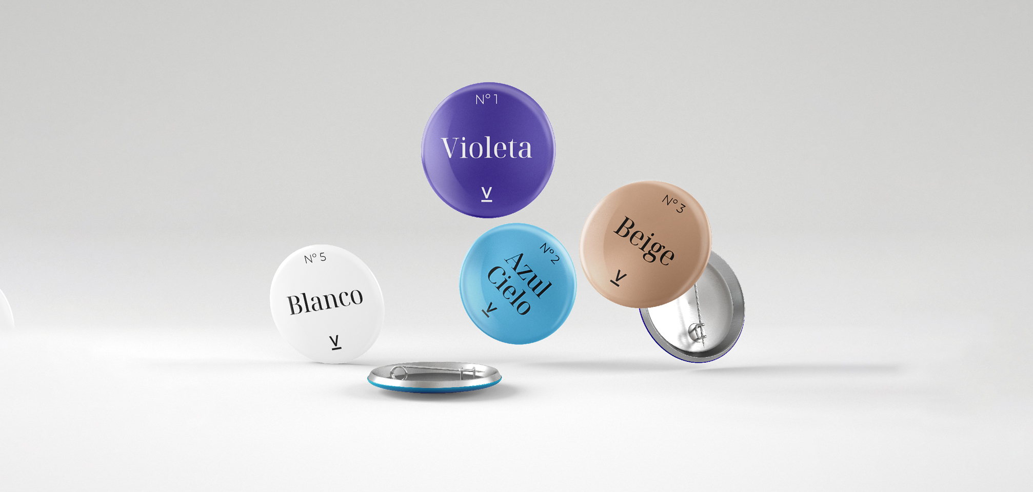
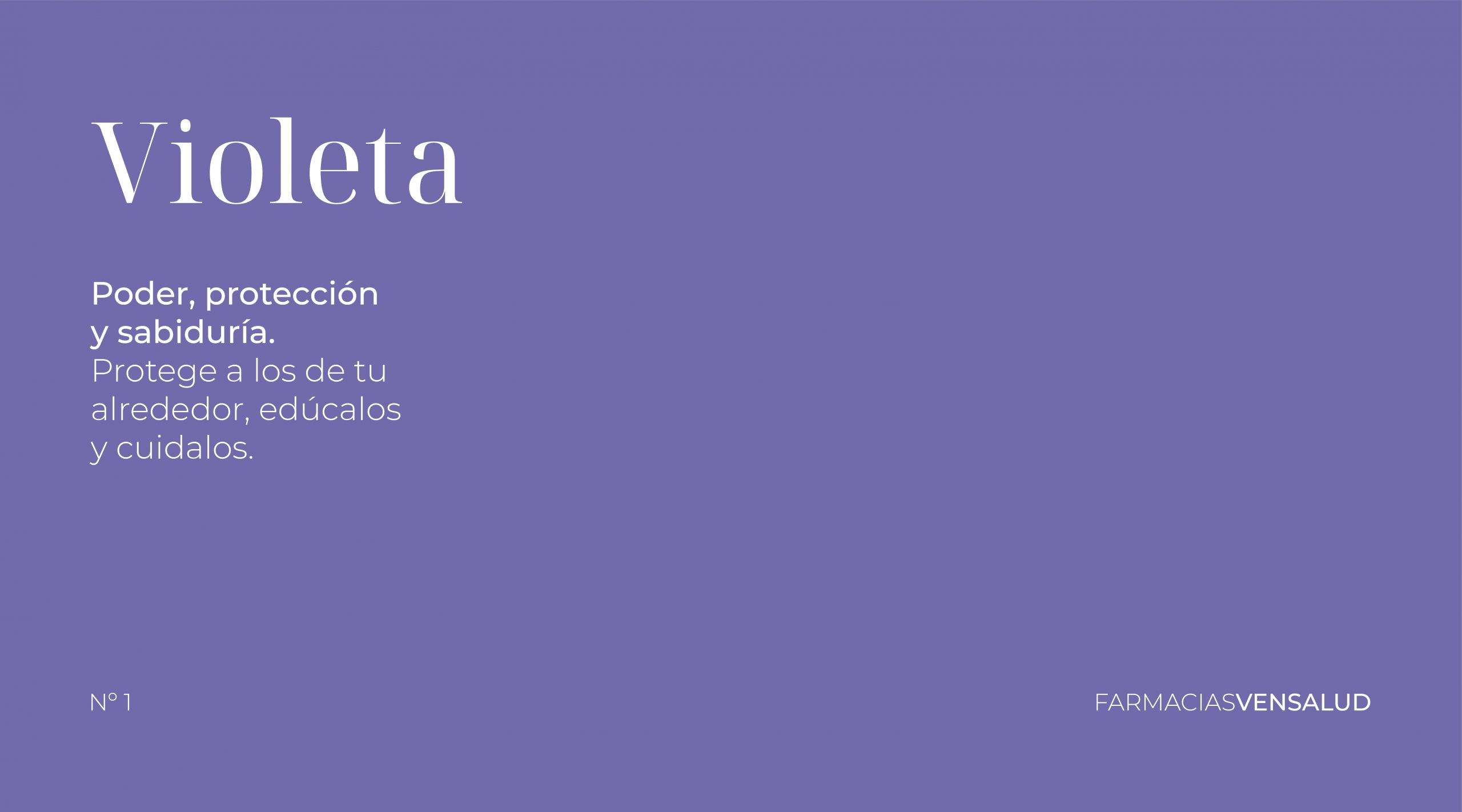
All the strategic work is focused on 12 colours, which are presented monthly. Due to the level of abstraction, each colour is linked not only to the sensation that the colour relays on, but also the time of the year it will be presented. This gives us the possibility of making a selection of products that are linked to the moment, to the sensation or the colour. This gives us a much wider range of work.
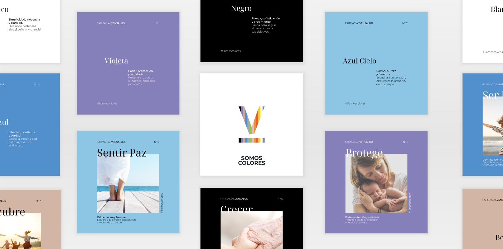
This campaign distances itself from any more traditional intentionality of the health sector of pharmacies.
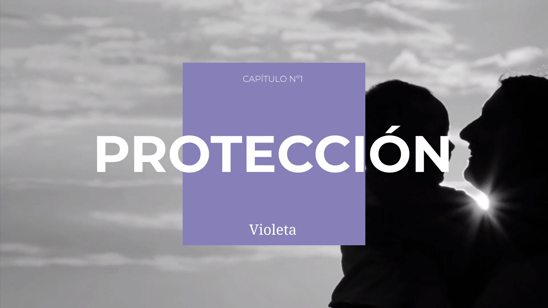
We started to work with the invisible factors, those we can’t see but feel, and therefore generate a greater impact on people’s lives. At a formal level, this campaign works under our Cyclical Branding® methodology, and it has an omnichannel focus. We work at a physical and digital level, each month a video welcomes us to the new theme to communicate and in physical aspects, we dress the pharmacy with the vinyl of the monthly colour, commercial signage of the message, which becomes the common thread month after month.

