Marc Guitart S.L. - Todos los derechos reservados
Menu

Caelles Pharmacy

New praxis are accompanied by knowledge.

Client

  • Caelles Pharmacy

Industry

  • Healthcare
  • Pharmacy

Áreas

  • Brand
  • Retail
  • Strategic Identity

This project was born with the aim of continuing a family saga of pharmaceuticals,

where tradition and new practices are accompanied by a knowledge that has been transferred from mother to daughter.

For the Caelles Family it was important to have a strategic development of the brand both at a visual level and in the experience in its retail. To explain to their users three concepts:

Who we are, where we are and where we want to go.

Having already a physical pharmacy in Reus, the challenge of creating and theatricalizing a new space in Ripollet was presented. An industrial town that grew exponentially in the 60s and 70s, due to a migration from different parts of Spain, especially Andalusia, which obtained work in the different industrial estates that existed. Being consistent with the reality of the place and the social environment that was presented, we decided to develop the project taking into account the essence and industrial idiosyncrasies that characterize this place, merging it with the professional value offered by this group of professionals who give life and human warmth to this project.

brandcelona_farmaciacaelles
Brand development

With our strategic developments in pharmacies, we seek to bring them into a new stage, a new language that adapts to the market in a real way with measurable benefits.

Where the knowledge of the professional and the intangibles will be the factors to be strengthened and those that mark the differentiation between the competition.

Farmacia Caelles, is part of the group Caelles, a family project composed of mother and daughters who sought to enter a new vision that allows them to develop in a new stage of strategic communication, taking their business idea to another level and seeking differentiation in the sector.

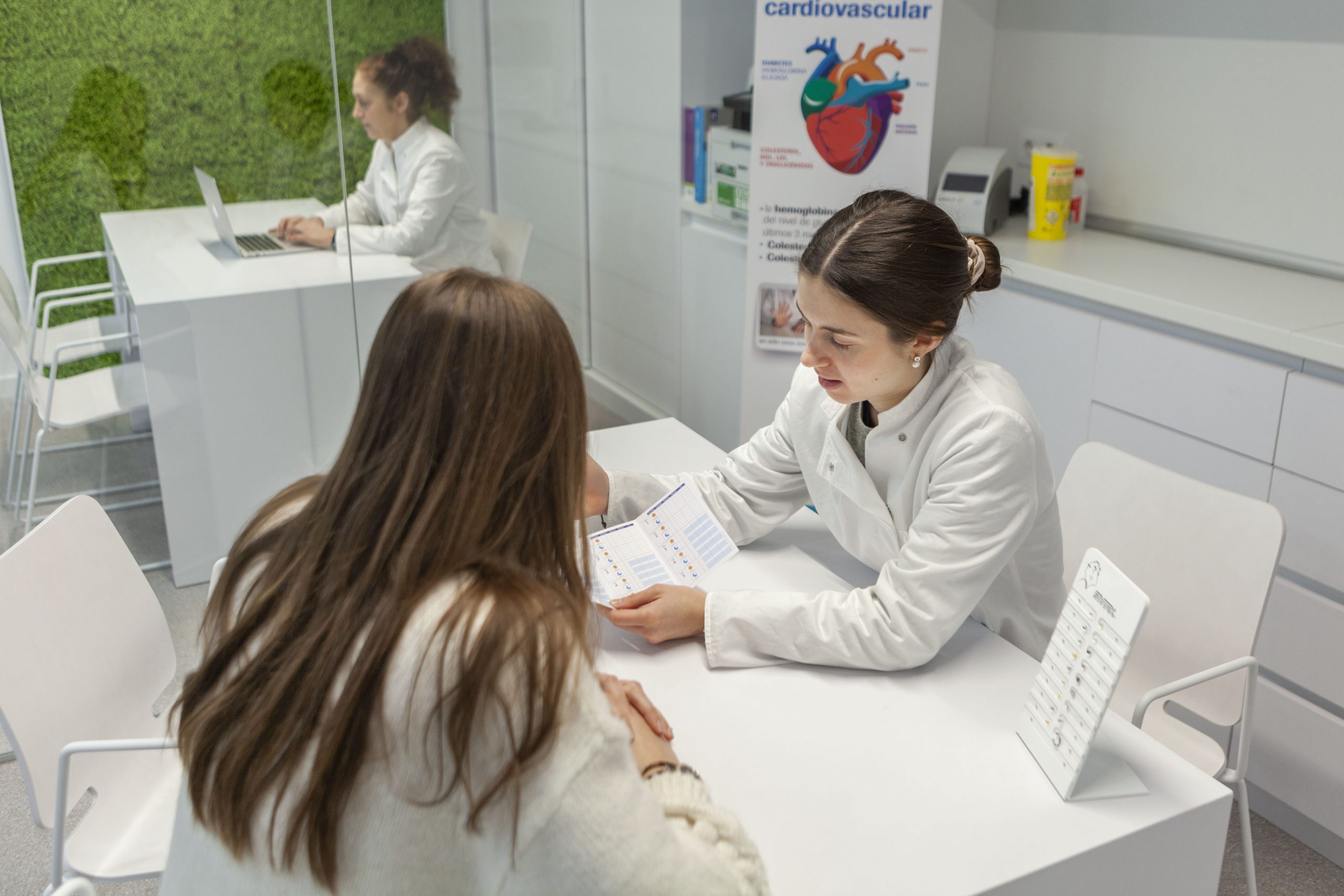
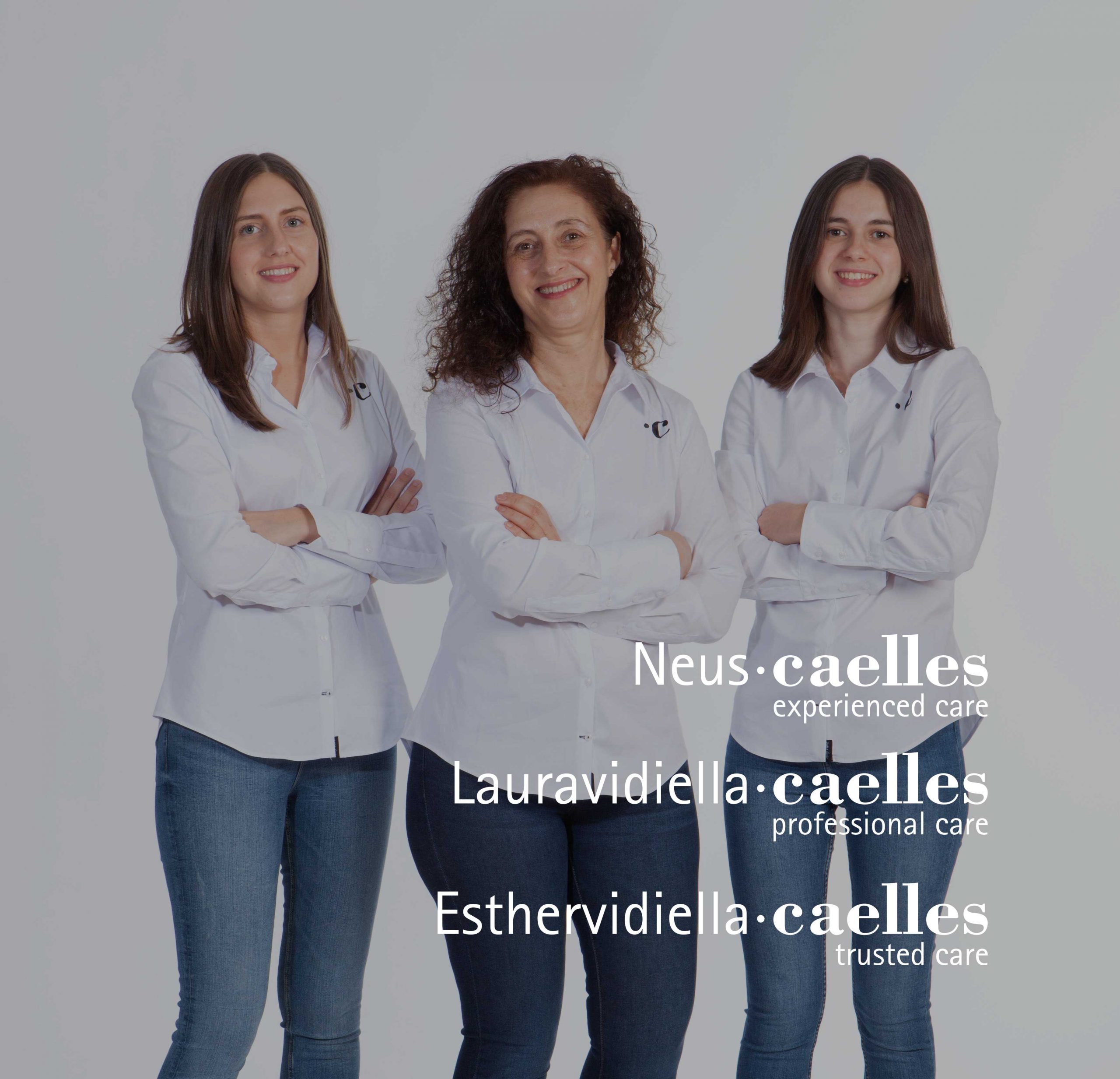
This project was born from an important value, the human factor. This is conveyed through the Personal Branding of these three professionals. Their personal brand is the value that makes the difference and their seal of guarantee; from this, we started to develop the communication by making a constant symbiosis with the pharmaceutical knowledge and the good work of these three professionals. For them we divided the project into three stages: Group Brand, Personal Branding and Retail. These three stages marked the roadmap to develop the project.

The brand was born from a rebranding that we brought under the same concept of Caelles, as a family and business unit, we focused the development of this brand with a sans serif typography that would evoke freshness and innovation, besides choosing a leitmotiv in English that would not go unnoticed by the new typology of users and to focus their business projection.

brandcelona_farmaciacaelles
View video

Following this, and with the group brand already defined, we had to give life and personality to the Personal Branding of the people behind the brand and endow it with personality, charisma and professionalism; therefore, we developed a sequential visual identity, which would give us the opportunity to function individually and represent a coherent group when used together.

An identity was developed that is based on three concepts:

  1. Supported visually by the «Caelles» with a serif typography that evokes the whole tradition of the sector.
  2. The graphic character used for the names is a sans serif typography that generates that contrast between innovation and tradition.
  3. Intangible value. The leitmotiv of each brand is linked to the intangible value offered by each one of them, it is their personal promise to people, where these three visions generate the real expectation of the users towards the brand.

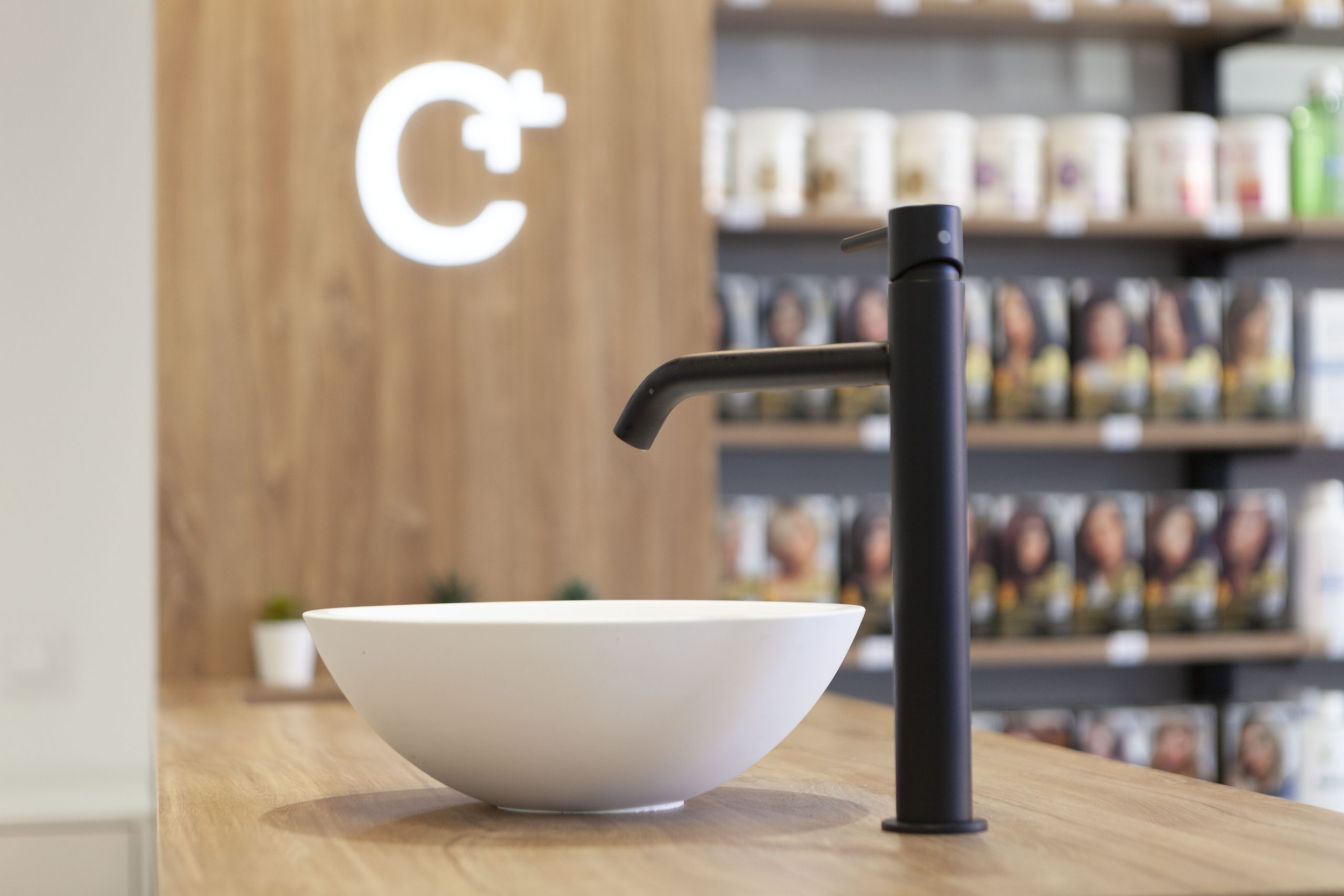
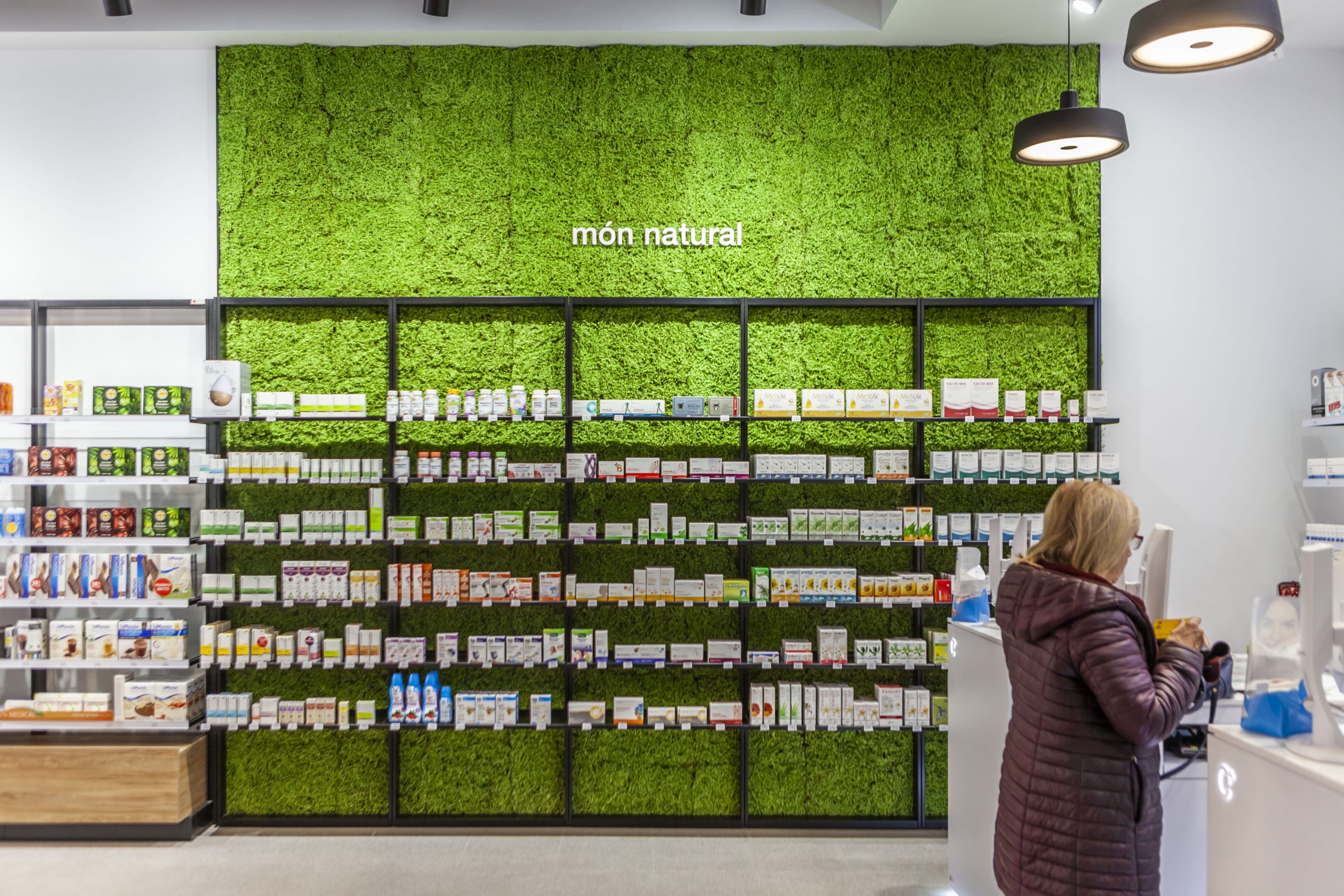
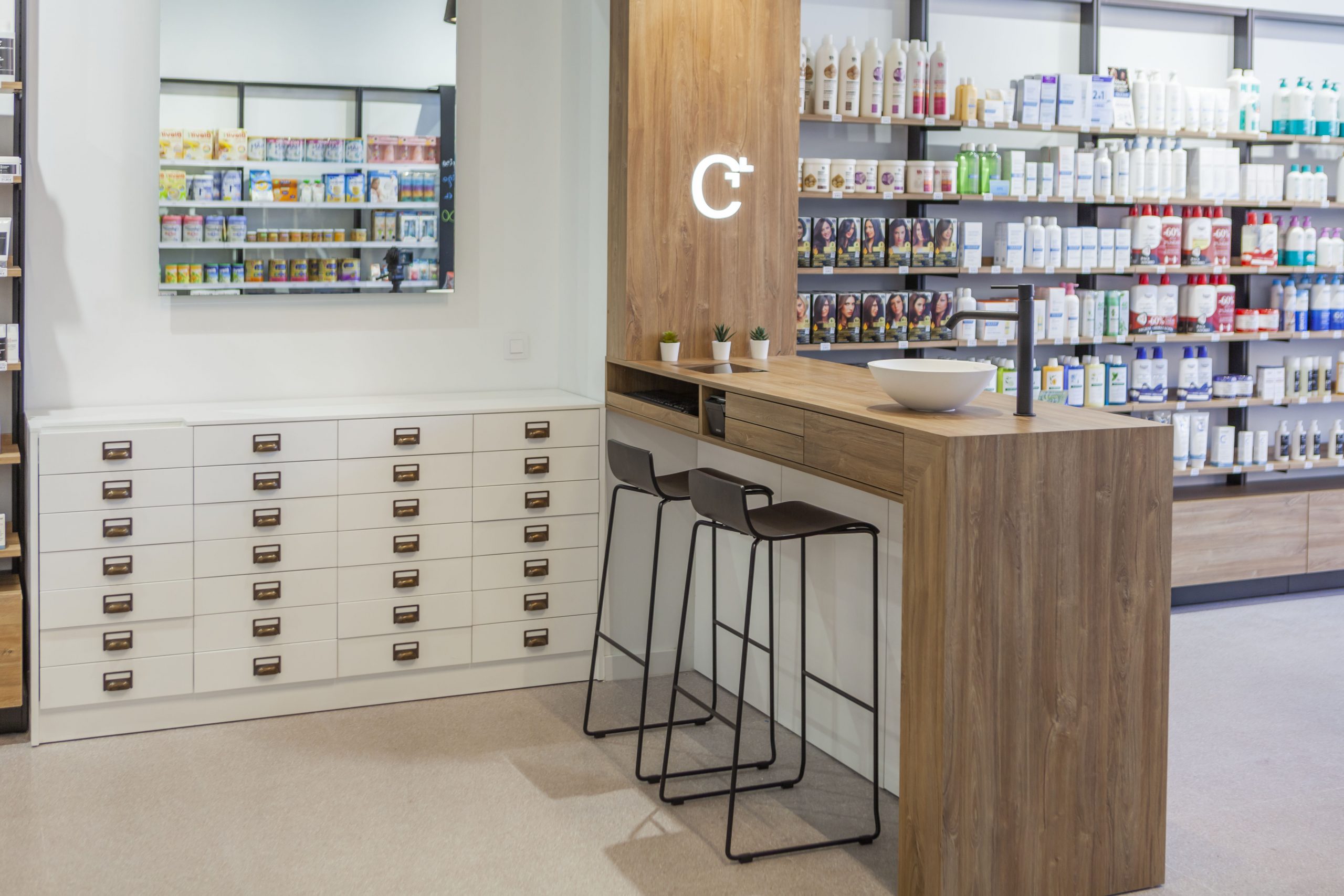
The last stage was devoted to the structural development of the brand experience in space, to its theatricalization; taking into account in its retail the idiosyncrasy of the place and its industrial heritage. Therefore, the materials worked on in the pharmacy had to be in line and coherent with this. Details such as the visible ceiling where all the installations can be seen, the metallic materials such as the shelves of the shelves or the product display modules emphasize this concept of industrialization.

brandcelona_farmaciacaelles

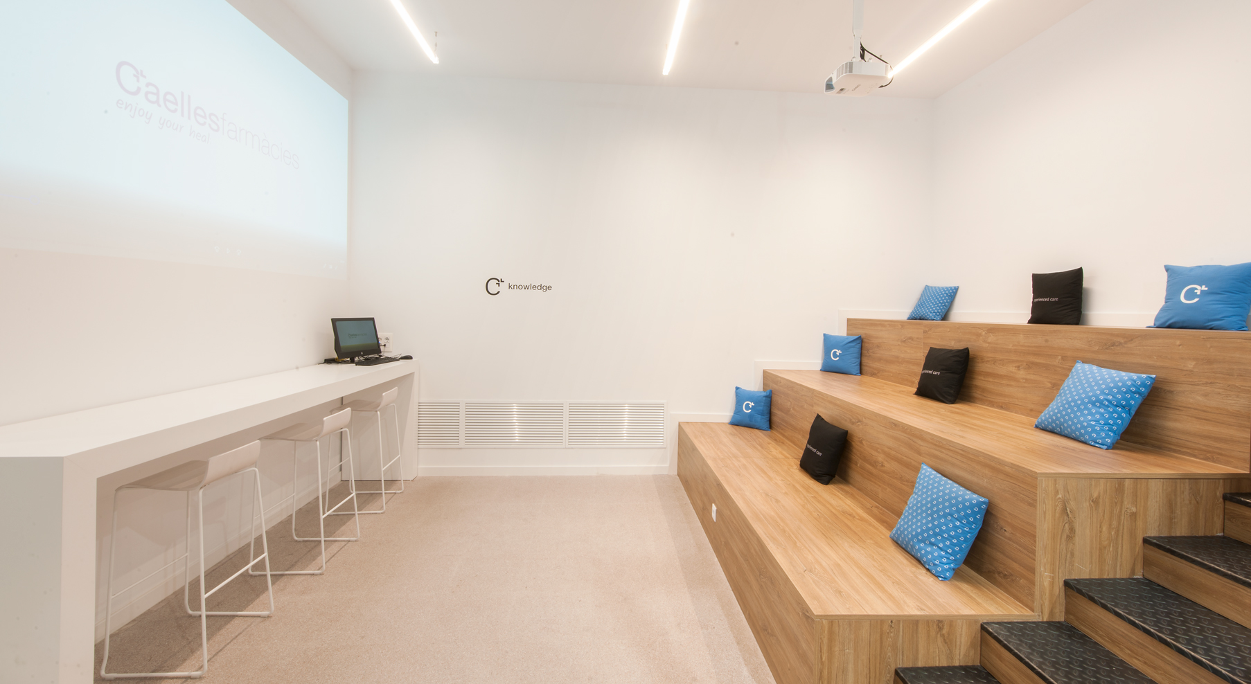
On the other hand, we wanted to greatly enhance the professional figure of the pharmaceutical owner, generating a knowledge space for training and informative talks, which generates a space of knowledge where the user is enriched, with a space where the training of people and collaboration with other colleagues or collaborators prevails. A physical space in the pharmacy where knowledge flows through its corners.

The significant spaces or Wow Effect are equally pieces that help to generate loyalty between brands and people, according to this, we destine a corporate space where the three partners of the group «caellesfarmacias» appear, to promote the concept of pharmaceutical group and family business. The image is accompanied by the Personal Branding of each one, with the corporate promise that explains the values of the brand. On the other hand, we also seek to promote the urban language, close and modern with a side full of hashtags in vinyl cut with the leitmotiv in extrusion, to emphasize the promise of the pharmacy and adapt to new needs of users in constant demand.

With our strategic developments in pharmacies, we seek to enter a new stage, a new language that adapts to the market in a real way with measurable benefits.

Where the knowledge of the professional and the intangibles will be the factors to promote and those that mark the differentiation between the competition.