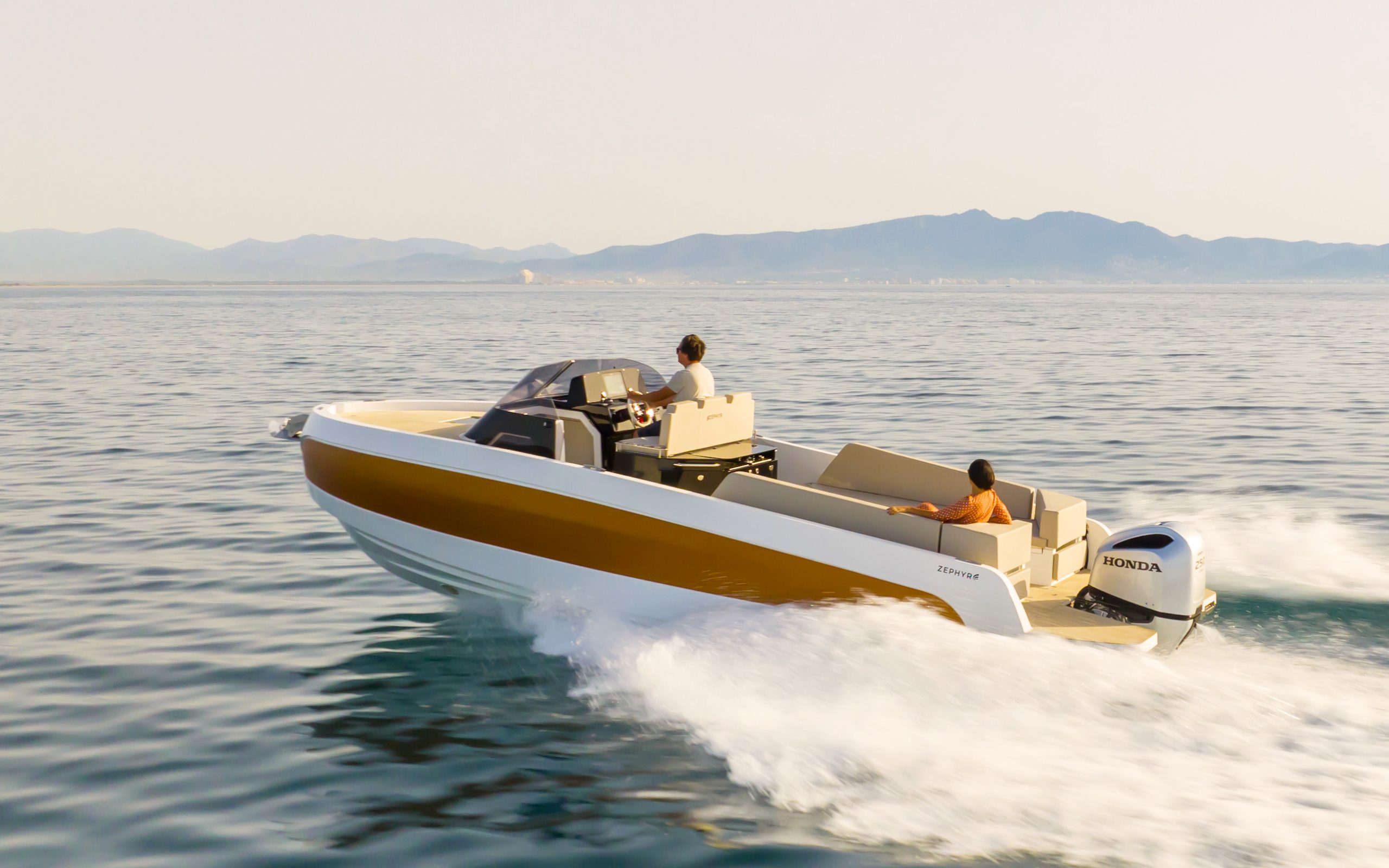
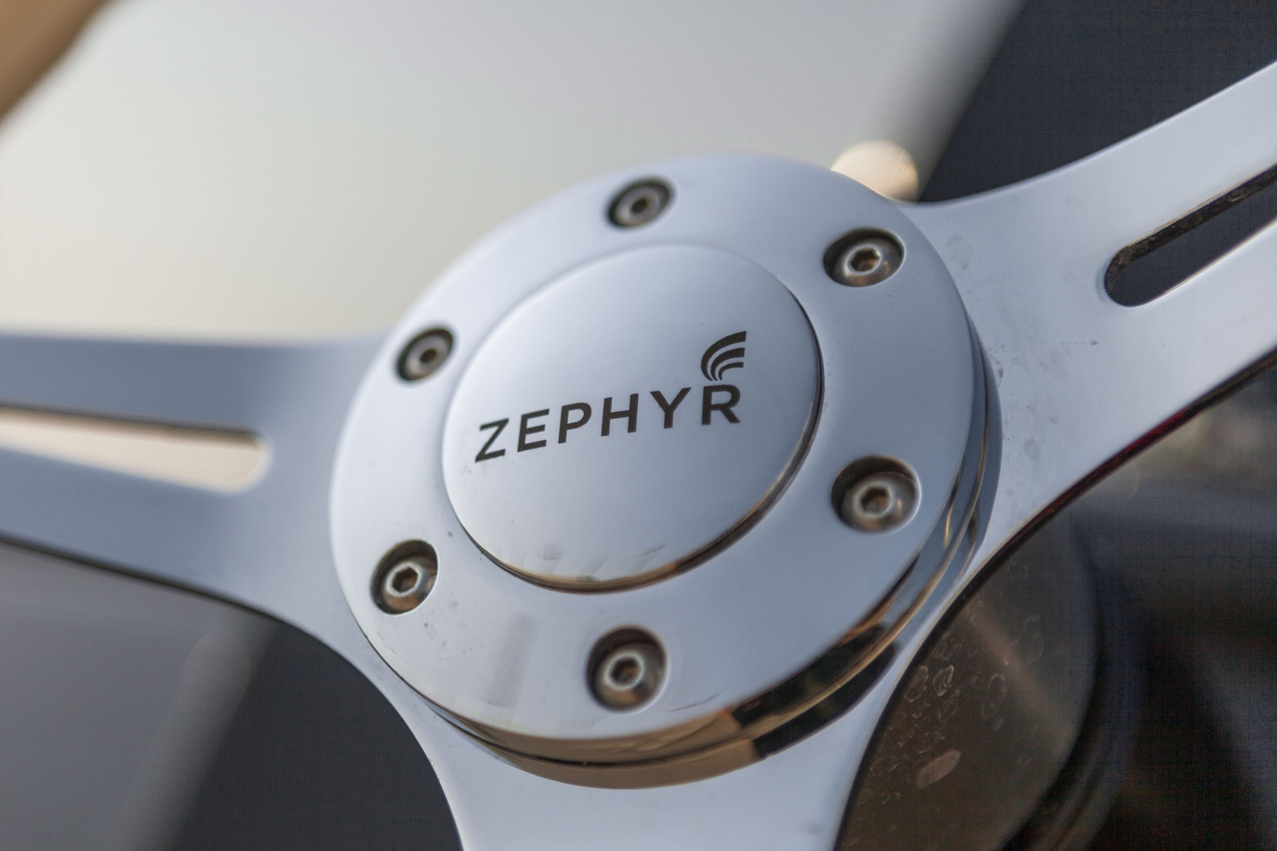
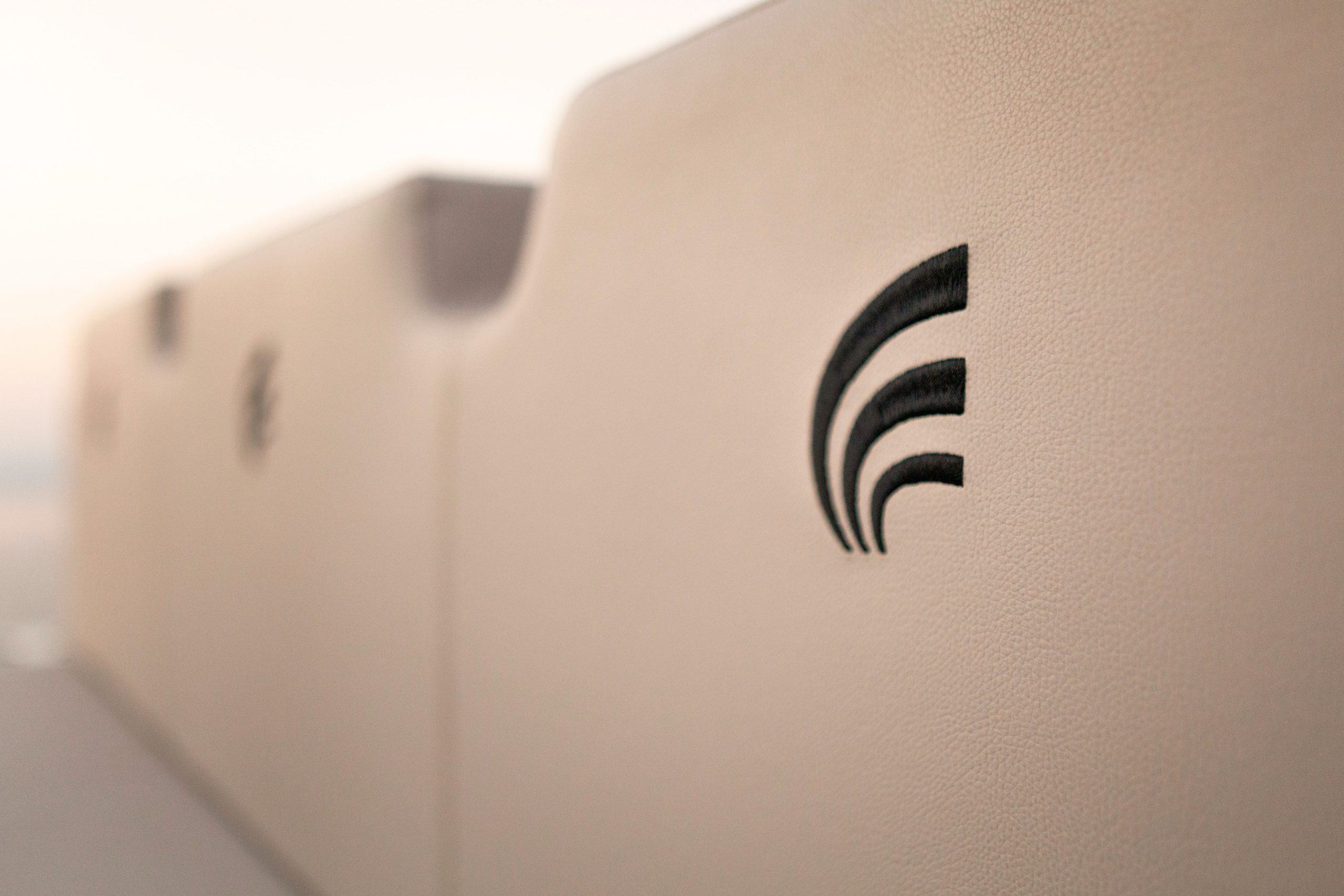
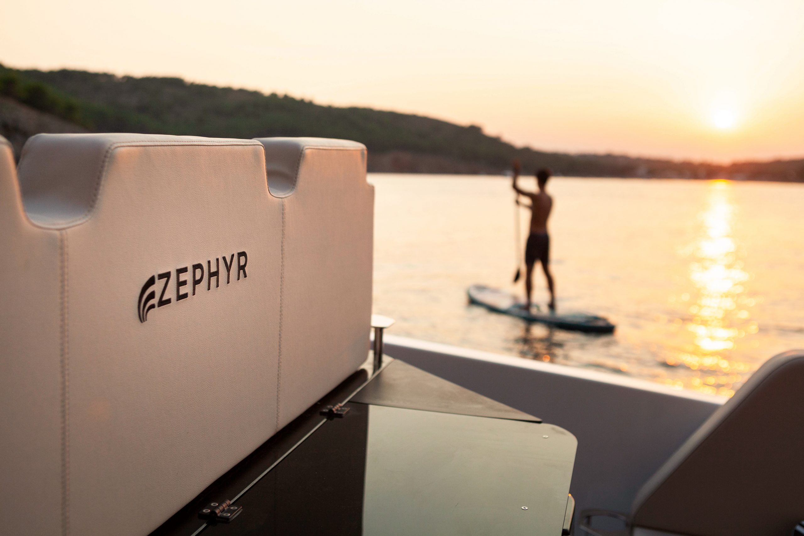
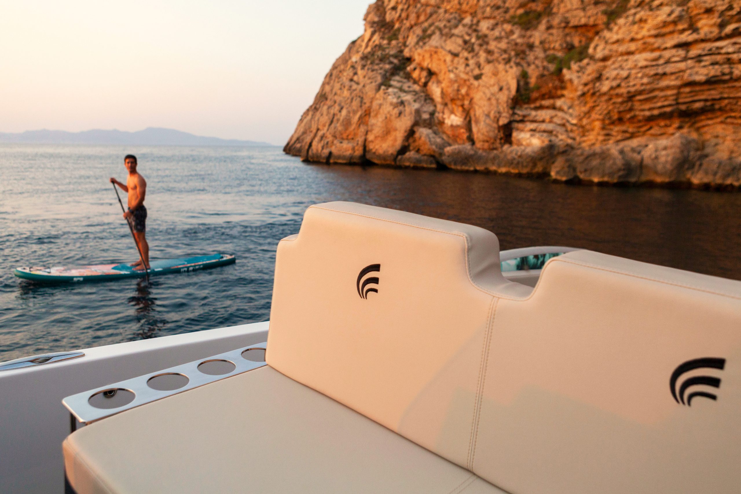
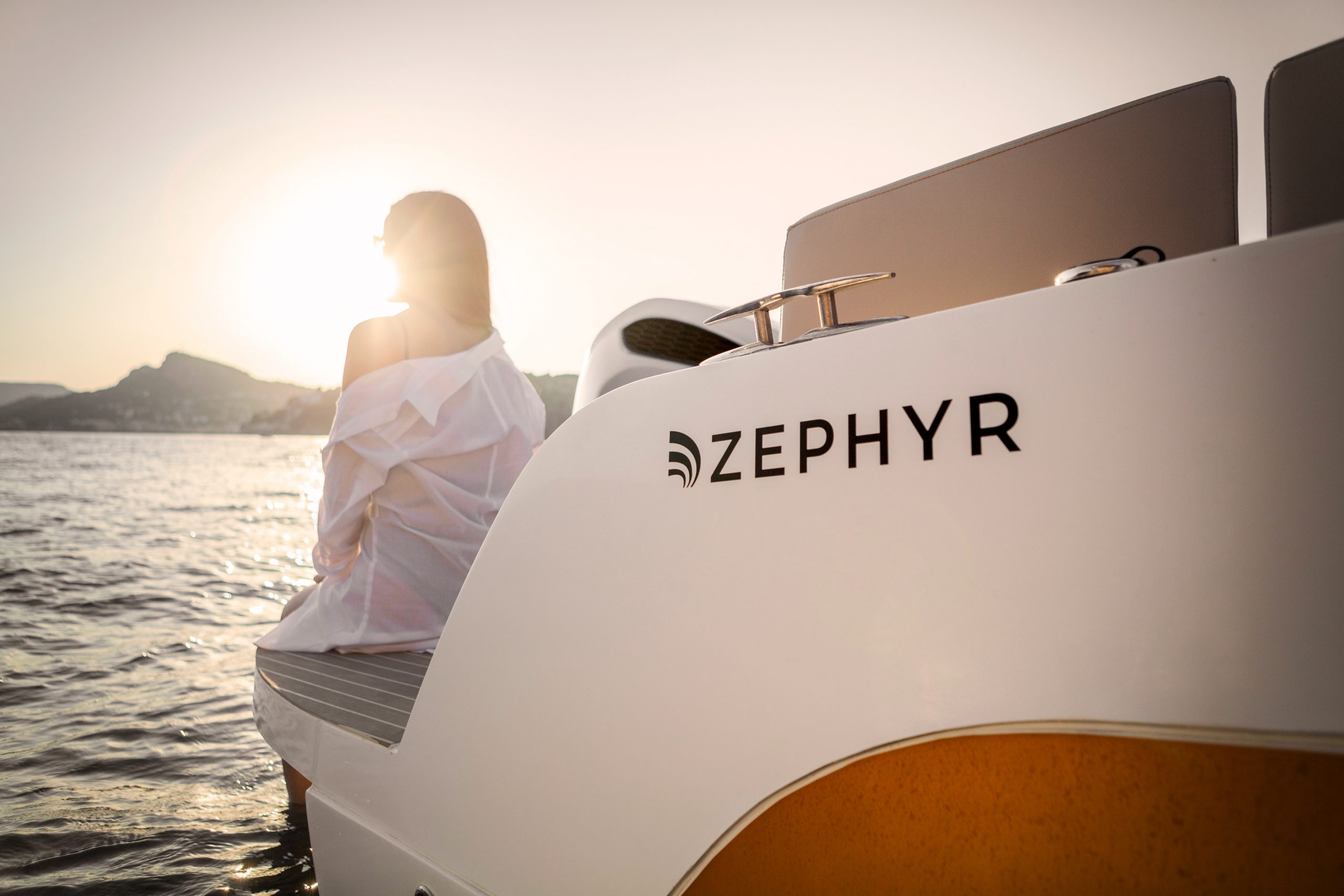
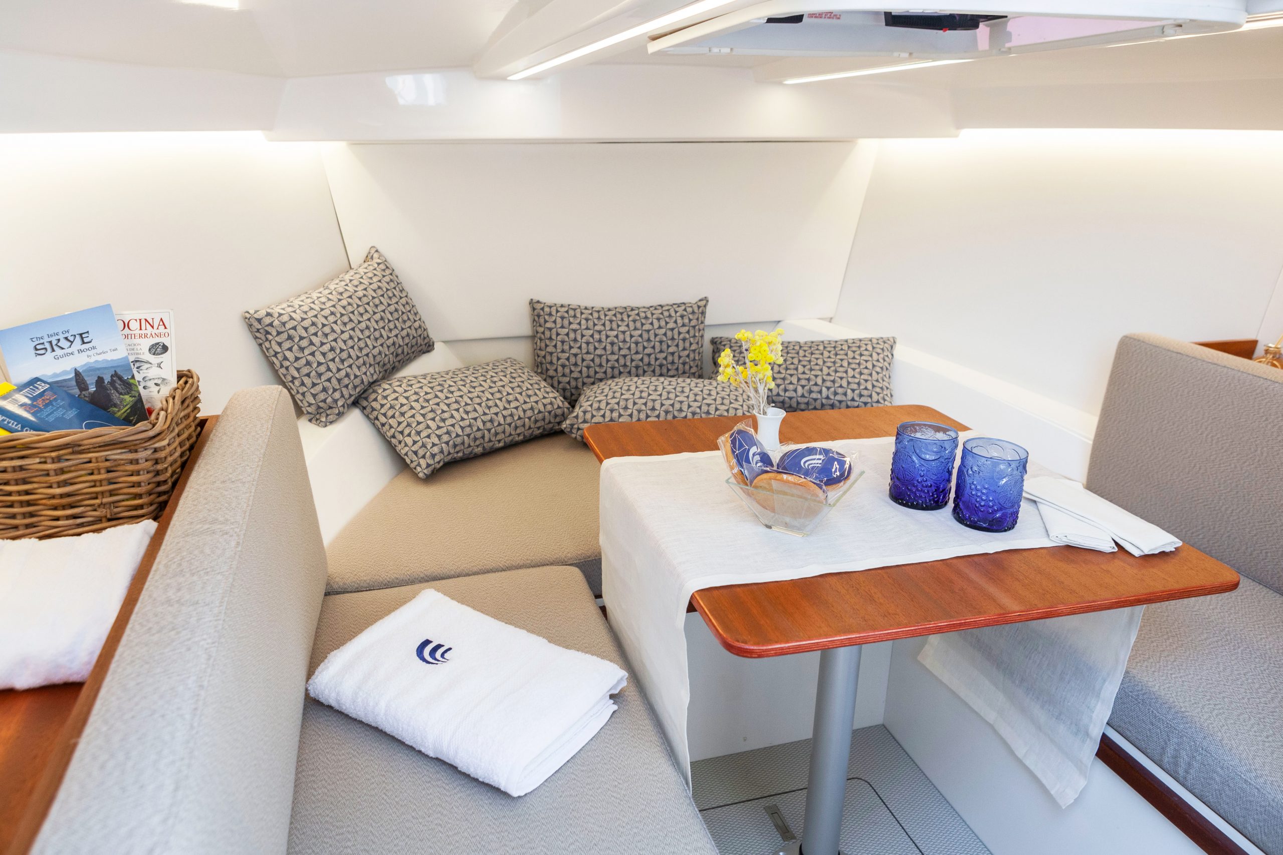
The graphic development for the Zephyr® brand is clear, simple and forceful, a brand with a dynamic symbol that refers to the movement of the sea, this should be its identity symbol.
Zephyr Boats
A meeting with the sea
Representing a brand through the essence of a place and its lifestyle, was a big conceptual and strategic challenge
for our Cyclical Branding® methodology by Brandcelona®. This brand planning process had the objective of transferring the product and design vision that Romà Pueyo, designer and CEO Founder of Zephyr®, wanted to transfer to their new brand that was about to be born. During this creating process, we had to think about the place where this project belongs as the main element for our strategic formula. In this creation process, we had to have as a special ingredient in our strategic formula, belonging to the territory in which the core of the project was located.
In the Northeast of Barcelona there is a place called l’Empordà, an emblematic area of the Catalan coast characterised by its whitewashed houses and narrow streets. Its fearless sea gives honour to the popular name “Costa Brava”, along with the blue tones and the characteristic winds of the area, such as Tramuntana, Marinada and Garbí, offer our sight a picturesque landscape, with a strong personality and wide gastronomy.

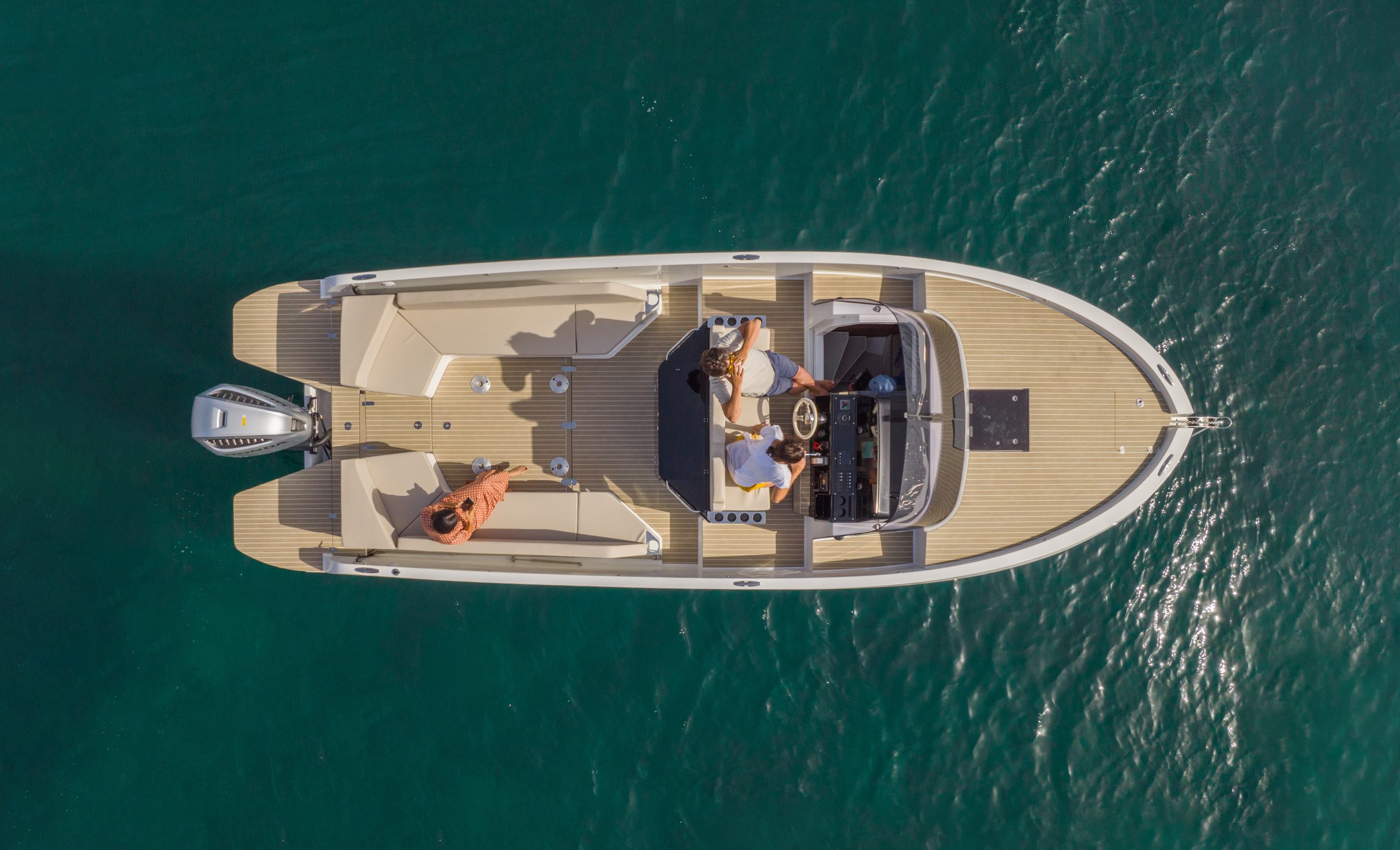
This historical place was chosen in the past by the Greeks, Phoenicians and Romans, here they implemented their first ports and it is to this day, the vestige of thousands of stories and events that still are, today, reflected on the environment, carrying a special symbolism and that we take as a reference for the brand development.
Zephyr® emerged intending to be a brand of reference in Costa Brava. To achieve that, we developed a strategic identity under the promise of “A meeting with the sea”, being this an emotional message from Mr. Pueyo. Thanks to his 20 years of experience in the nautical industry, he decided to take a step forward by creating this new project, with a special character, which aims to establish an emotional connection with the sea.
The graphic design for the Zephyr® brand had to be clear, simple and convincing, with a dynamic symbol referring to the sea movement, as a symbol of identity. Its grotesque typographic composition allows us to use it for both traditional communication and digital media, offering a solid and coherent omnichannel strategy.
