The search for innovation is an arduous task born of curiosity and excellence. Mediform asked our creative team for a new way of identifying strategically with its target audience, where the main task was to show a new, fresher and more agile way of proceeding, this with the mission of showing new generations a more current and real vision of what a pharmacy and everything that encompasses it is today.
Mediform
Brands that draw futures

Mediform plus was created by Luis de la Fuente, with the aim of bringing innovation, training and practical learning to the pharmacy sector.
On this path of seeking excellence and distinction, Mediform works under the clear idea that «The future cannot be improvised, it must be planned». As a consequence of this objective, this business organization is the bridge between pharmacists and professionals specialized in the diversity of products that help to grow the offer and effectiveness of pharmacies.

Branding strategy creation and positioning through visual and verbal communication development.
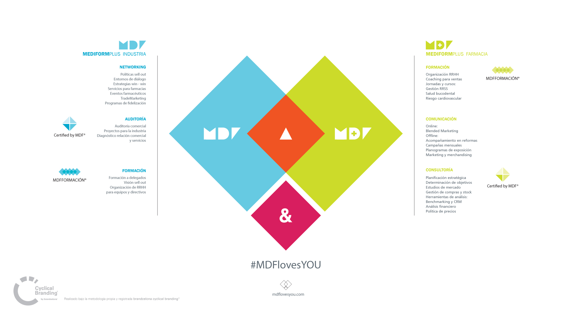
We retouched the MDF acronym to achieve, through geometric shapes, a totally pregnant and memorable symbol.
The + icon disappears giving rise to a non-descriptive and less recurrent geometric symbol.
Through a much-consolidated typography (Franklin Gothic) and with very good legibility, we worked this proposal of easy recognition.
We added an aspirational leitmotiv, discarding any description to emotionally link the brand with its users.
