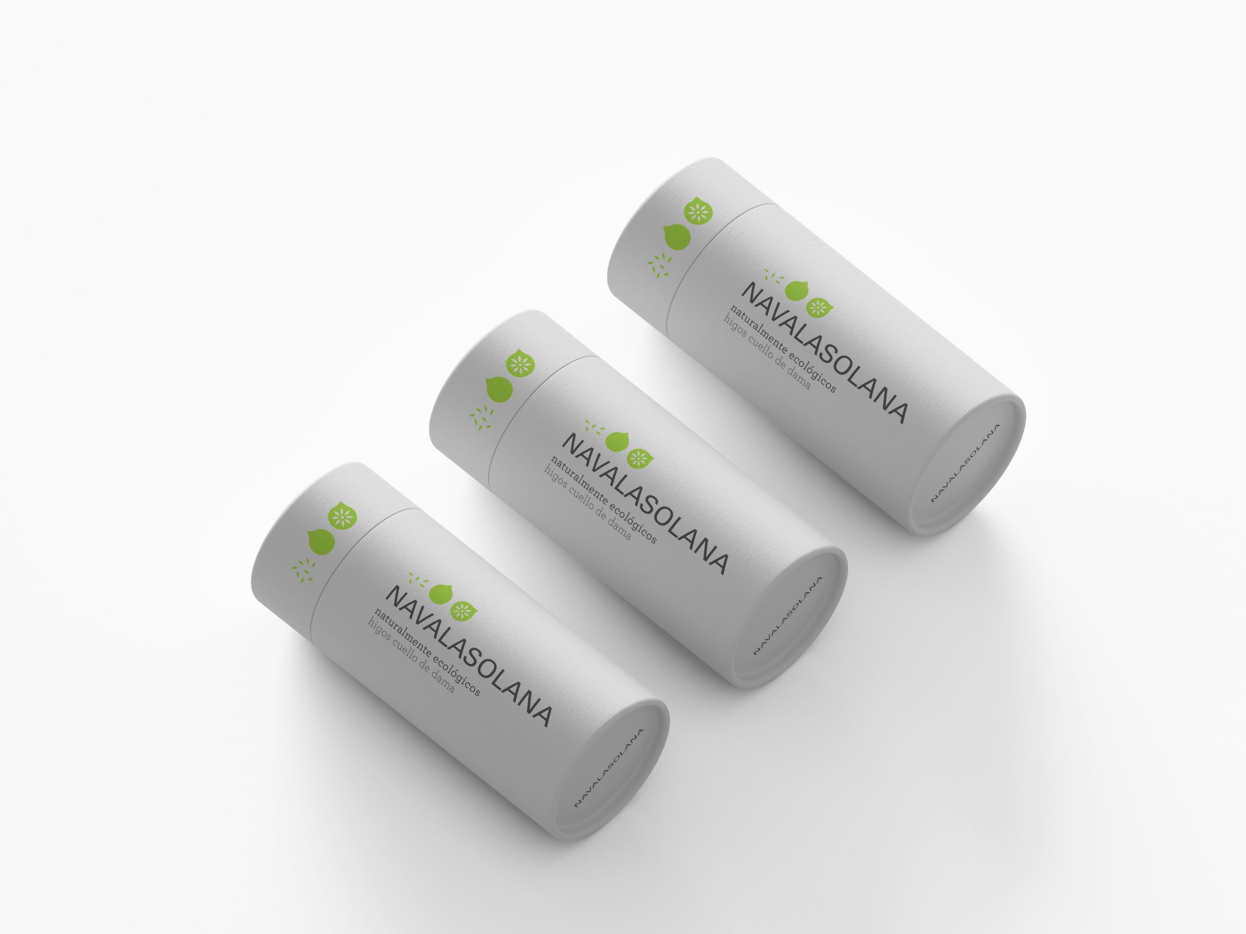
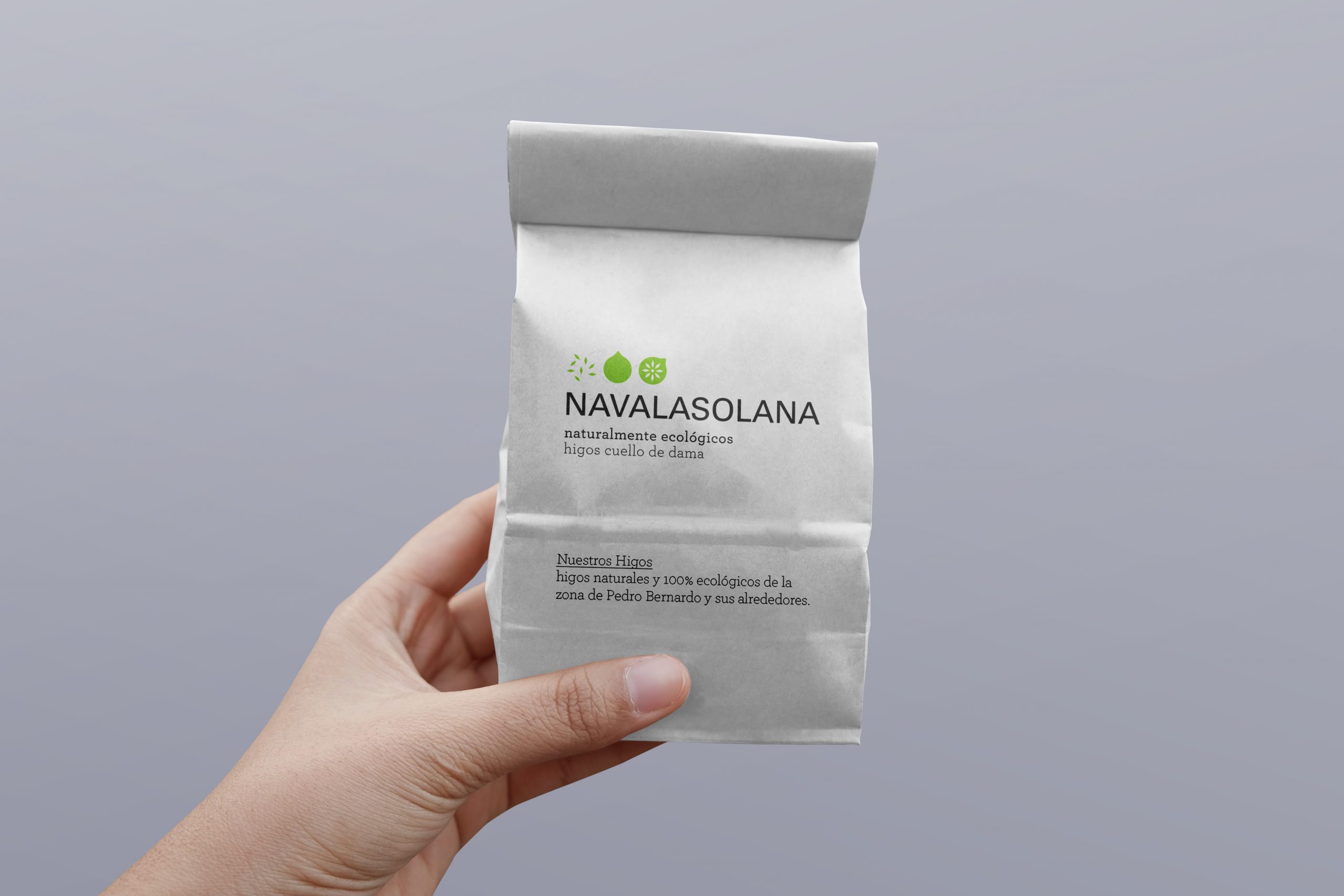
The symbol, consisting of a fig appearing in sequence (seed, growing fig and open fig) represents production and the passage of time. The colour of the brand symbolises the greenery of the springs in Pedro Bernardo, choosing a saturated green to give it a modernised and more striking touch.
Navalasolana
Representing the dedication and hard work of local farmers.

Navalasolana was born from the need to create a brand for a product from Pedro Bernardo, a village located in the Tiétar Valley.
In this town, some specialities stand out such as oil production or the dried fig of Cuello de Dama.
With the aim of promoting the production and trade of native Cuello de Dama figs, Navalasolana was created, a brand specialising in this type of product from the Pedro Bernardo area. An organic product, carefully selected and prepared by the best farmers in the area. The brand was created with the aim of representing the dedication and hard work of the local farmers.
Brand development
