A strategy is developed where two corporate typographies coexist, a Sans-serif typeface representing modernity that coexists with another serif typeface that will be the one that builds the brand logo. With the use of the second typeface, we want to represent the historical background of the brand as leading us to a more classic concept.
La Despensa De Palacio
craftsmen's sweet
Located in Estepa and Seville, we find La Despensa de Palacio, a family business dedicated to the world of sweets and chocolate.
To speak of La Despensa de Palacio means history and tradition, of lineage, of an art that has been shared from one generation to the next, from 1743 to the present day.
With a wide professional background and rooted in Seville, we have developed a corporate strategic plan adapted to the needs of today’s users. We evolve and offer a qualitative leap in its identity to offer an omnichannel brand that can communicate coherently and optimally in offline and online environments.
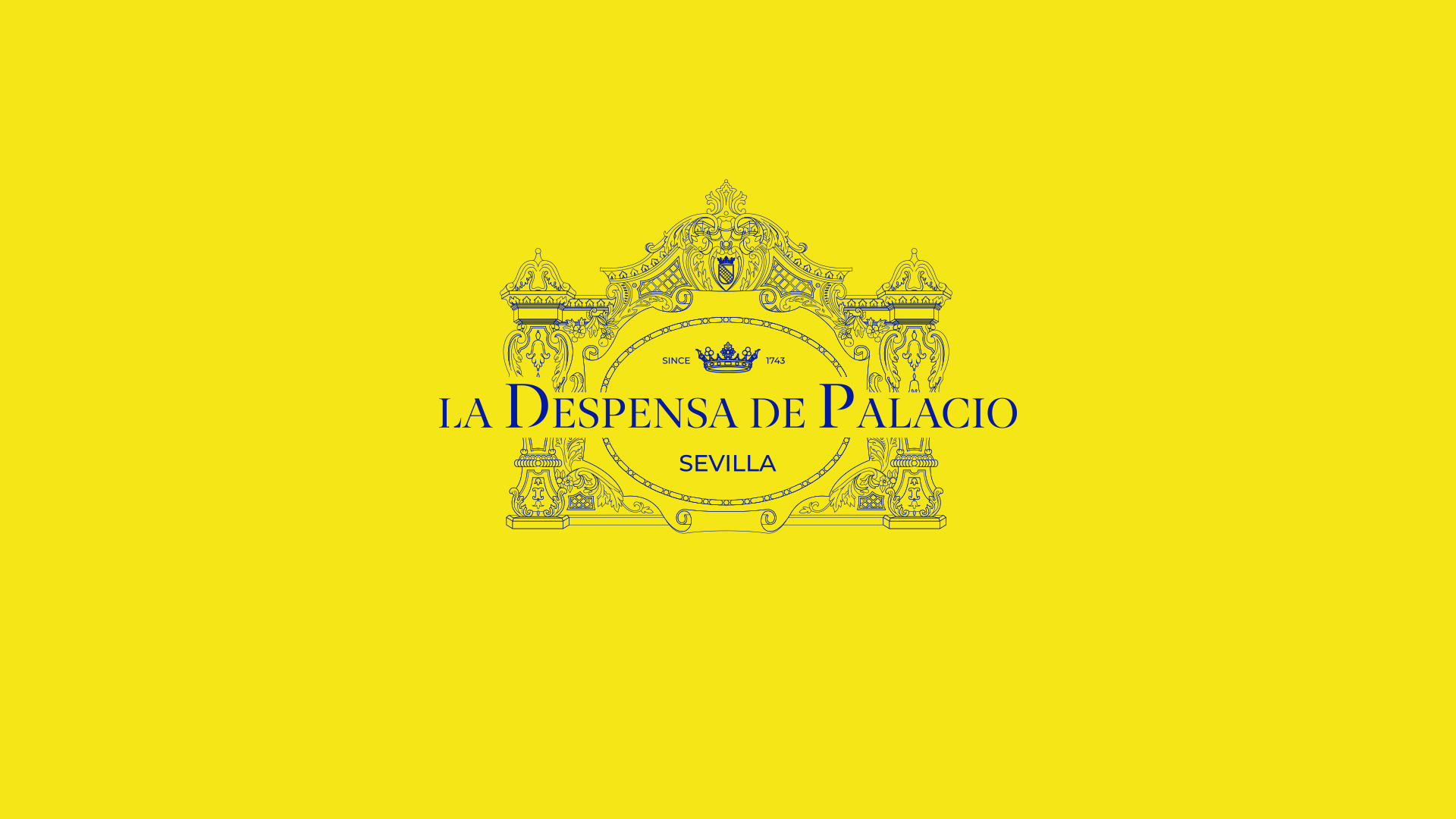
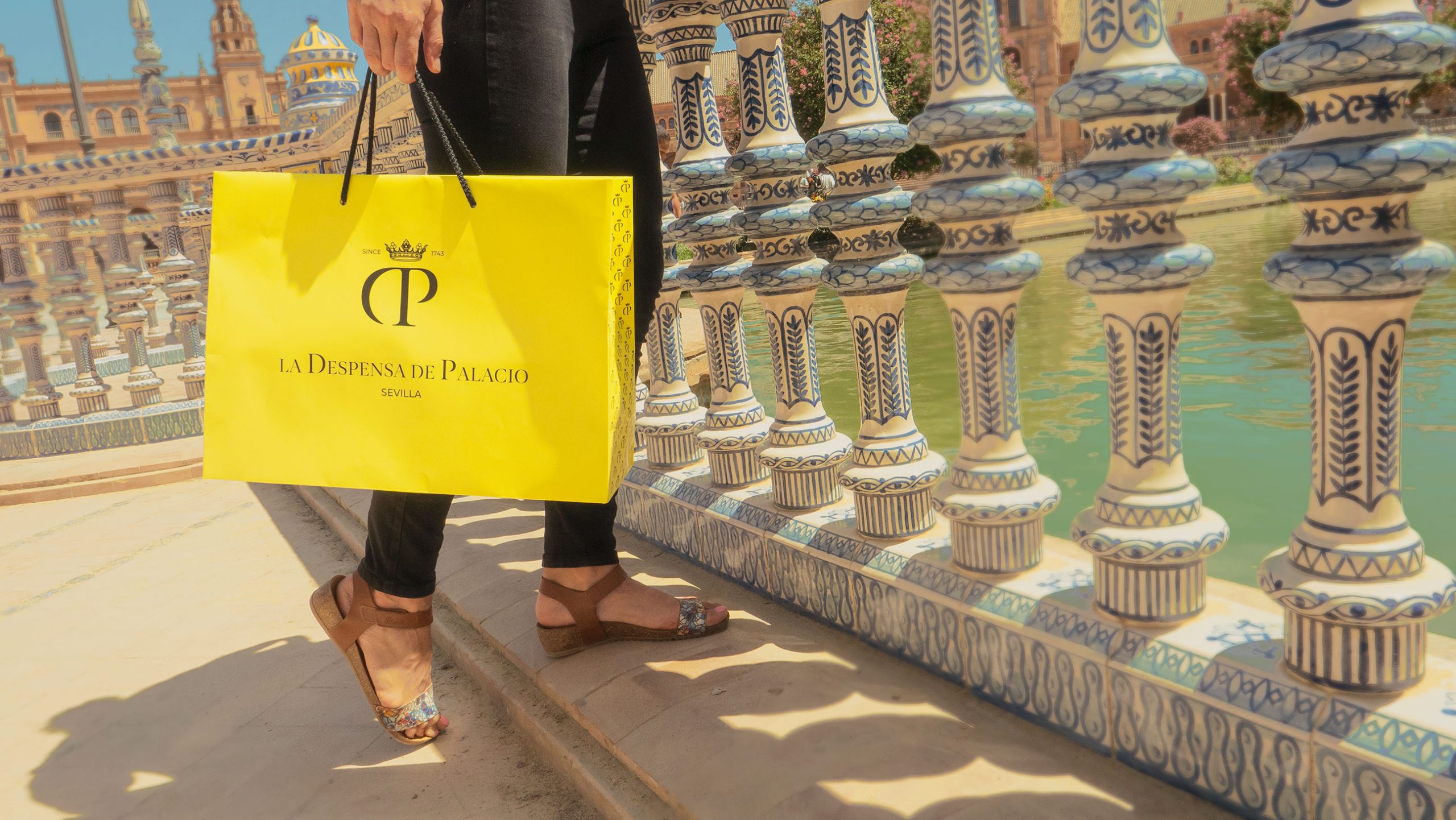
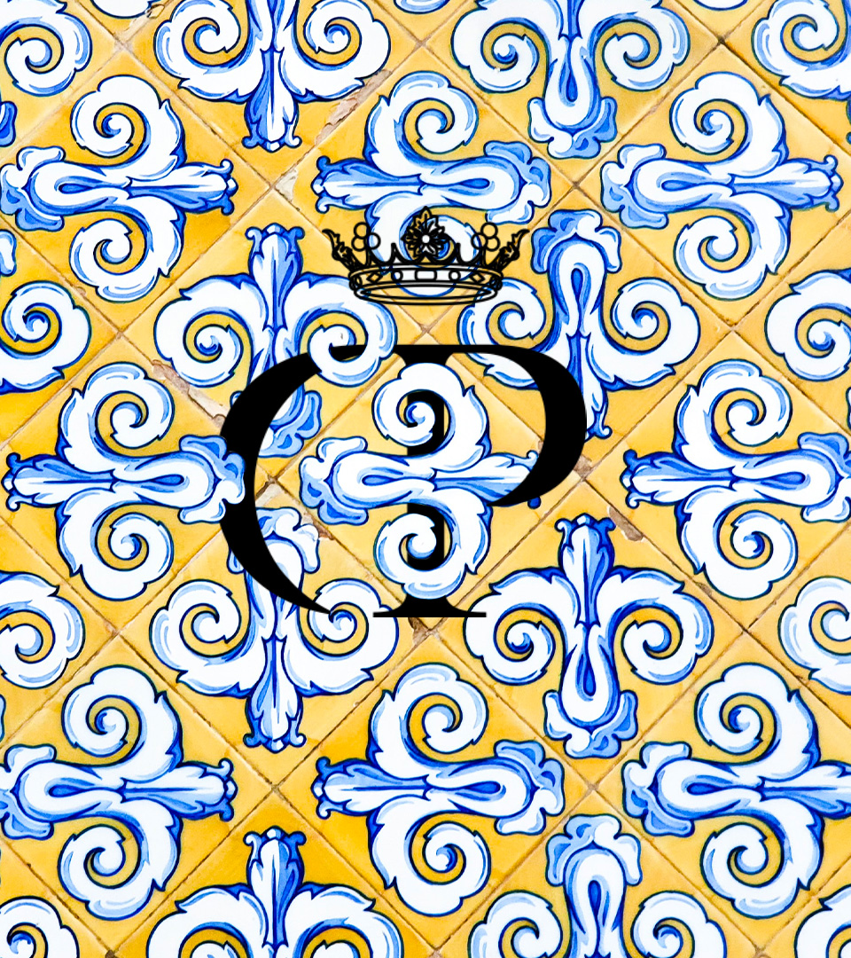
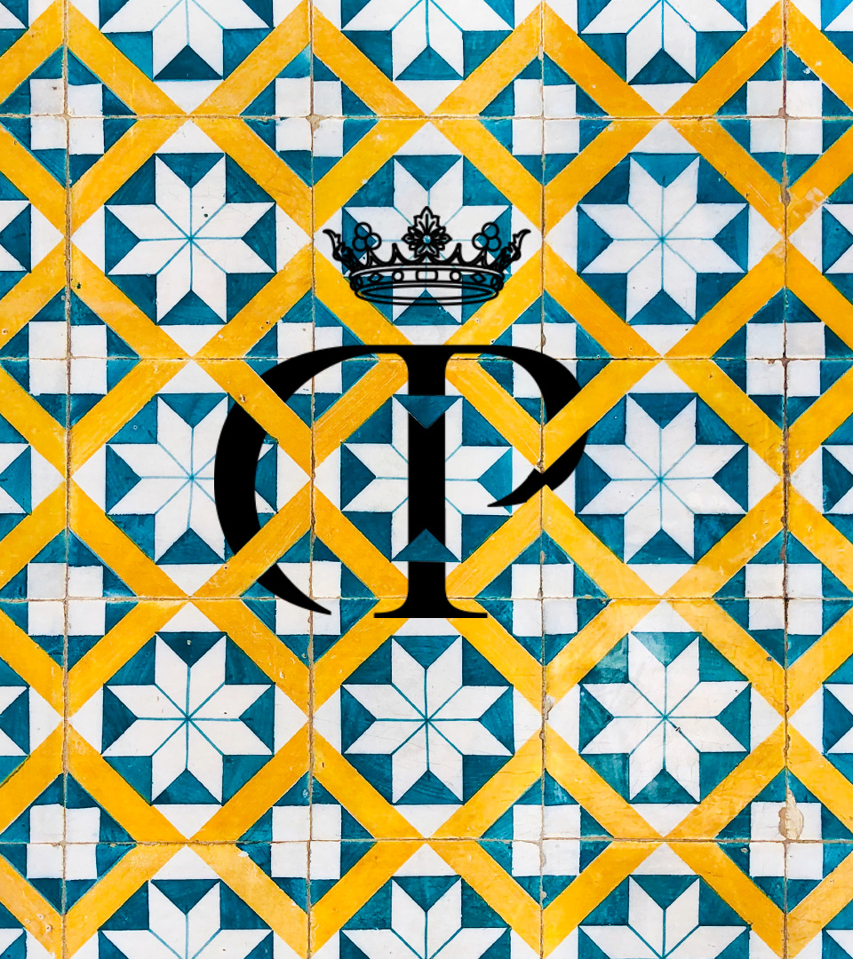
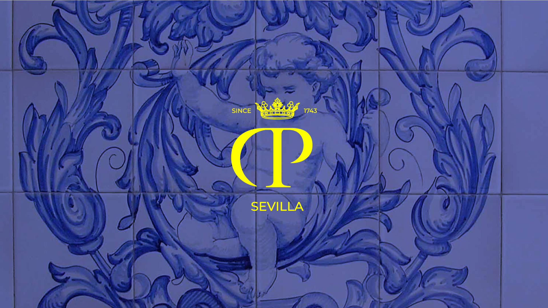
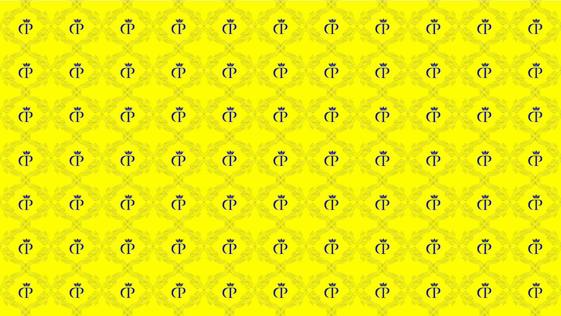
With the intention of keeping its essence, we can easily identify the brand through its classic illustrations that represent it. It will be recurrent to use more classic patterns. However, they must work under the current standards where all the elements cohabit in the same communication environment in the most optimal way. History and modernity will be the values from the new corporate strategic development. The binding corporate elements of the identity will be the composition of the crown paying homage to the history with the Marquisate of Estepa, the DP symbol as an abbreviation of the logotype and the Seville baseline offering territorial value to the identity as a whole.
This symbol composition is used as a corporate tool and offers an enduring and identifying solution for the company, its team and the territory.
