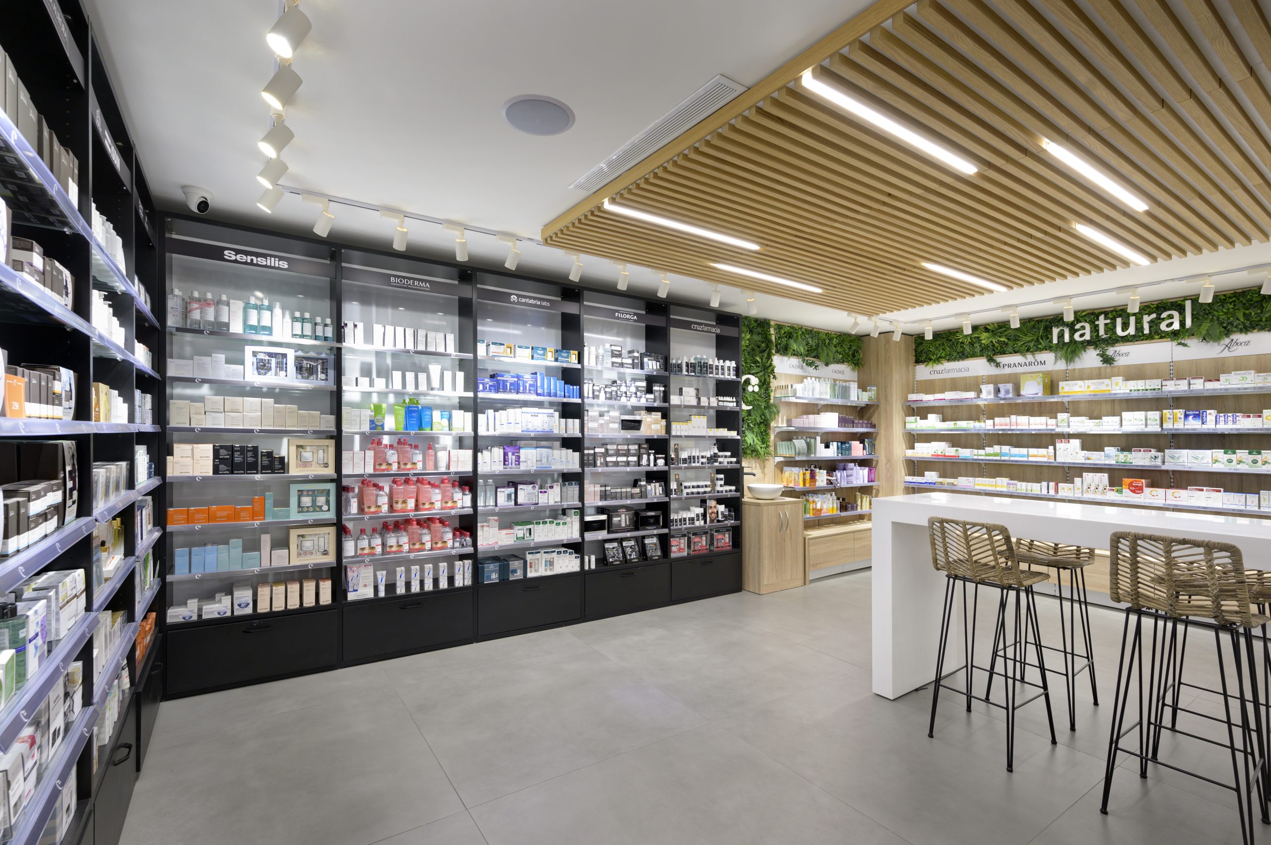
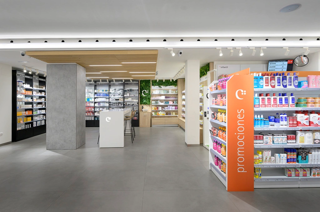
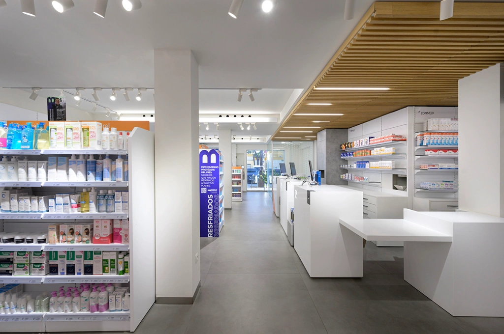
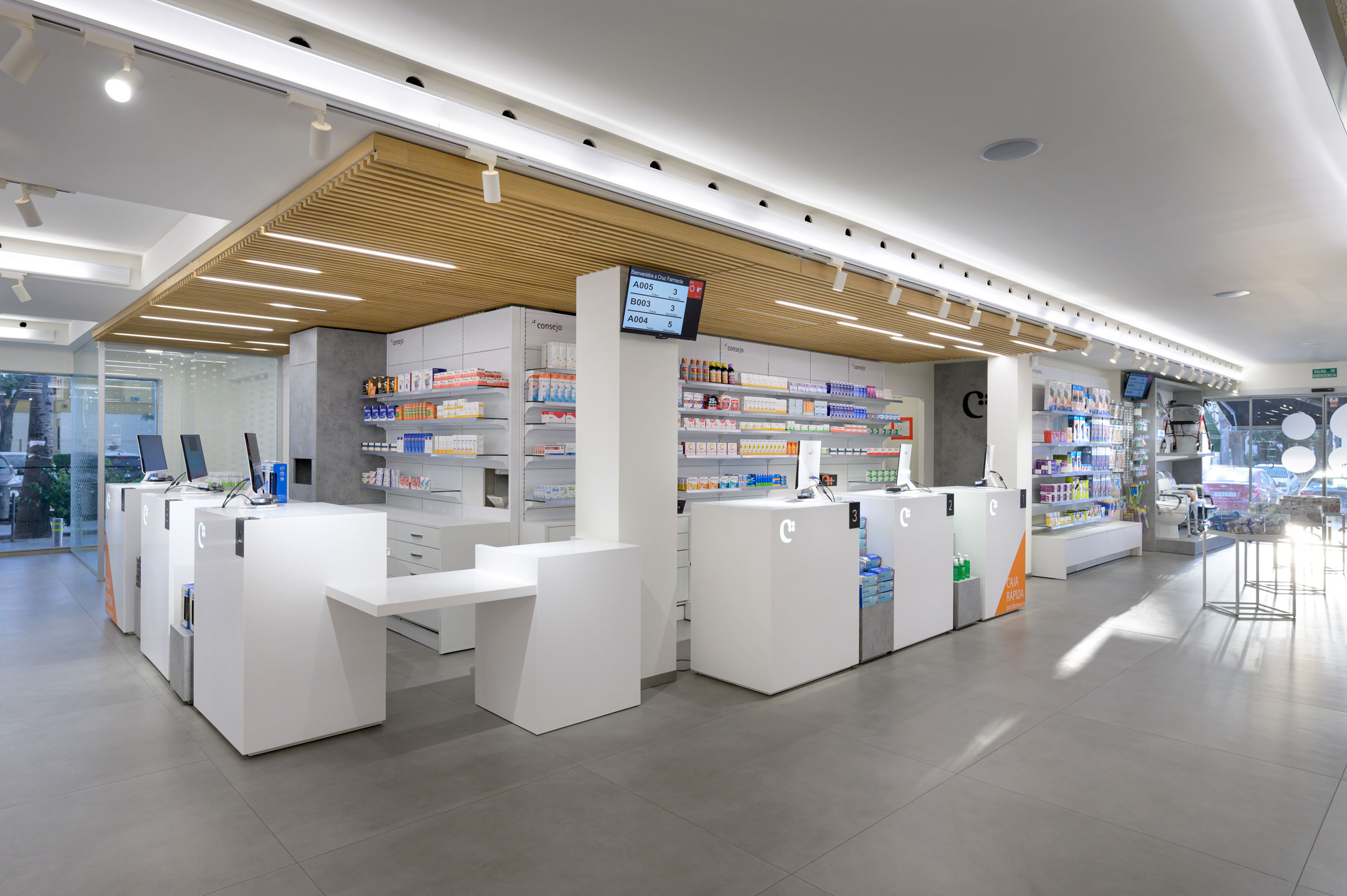
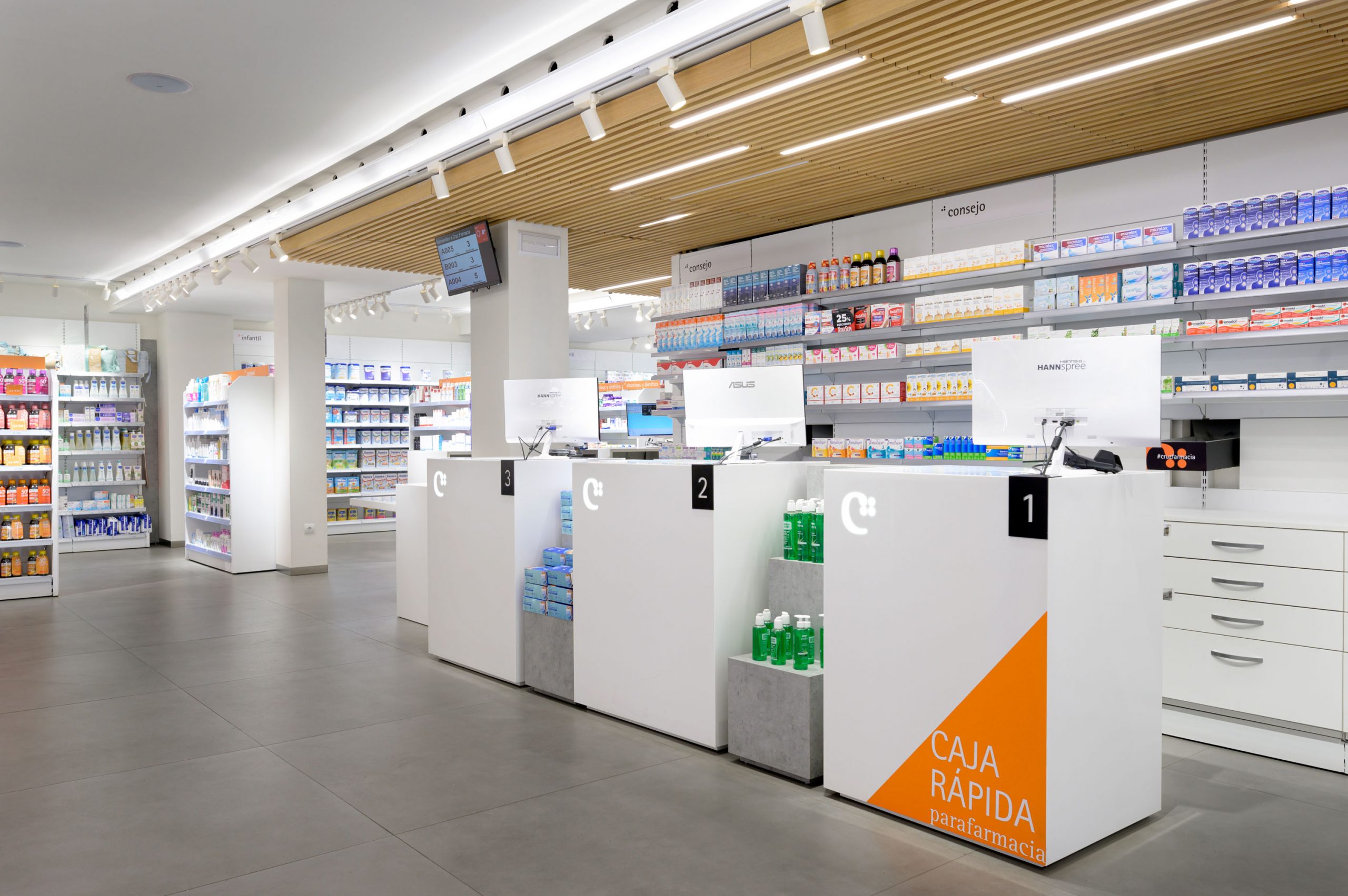
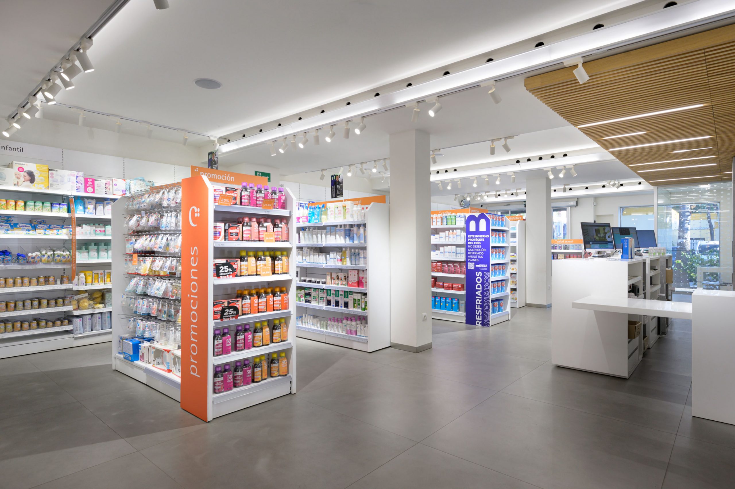
Development of the brand universe at the strategic, visual and spatial communication level, including strategic omnichannel identity, applications, furniture and retail, as well as corporate training for the team.
Cruz pharmacy
Life partner. Health Lovemark

After 10 years helping Cruz Farmacia design their brand to adapt to new make realities
Brandcelona took on the challenge of reworking the retail design and create a coherent and efficient brand environment.
By applying a significant change in the way customers are attended, Cruz was able to enhance the brand experience for their customers by positioning themselves as their partner for life’s important moments.

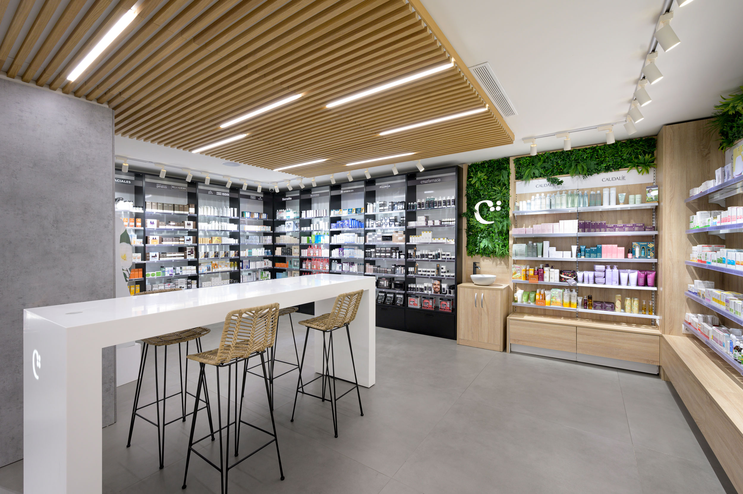
The decay of logocentric brands. The values and spirit of a brand are no longer represented by a simple logo or corporate palette, contemporary brand systems are complex webs of expression, reaching audiences in the form of branded content, collaborations and narratives. Logos alone don’t hold the same power as they did ten years ago.
To design this commercial space, we use our three D´s:
Design healthcare spaces to win people’s hearts.
Discover and learn to design a healthcare space with a unique concept.
Differentiate the commercial areas in the retail, so that they are aligned with the brand strategy.
In our strategic brand designs, we create business in the core of the brand. We are living in a world where brands must differentiate themselves from each other.
In this project, you will learn what a healthcare lovemark is and what are the factors that define it, and then apply these elements in your pharmacy’s design.
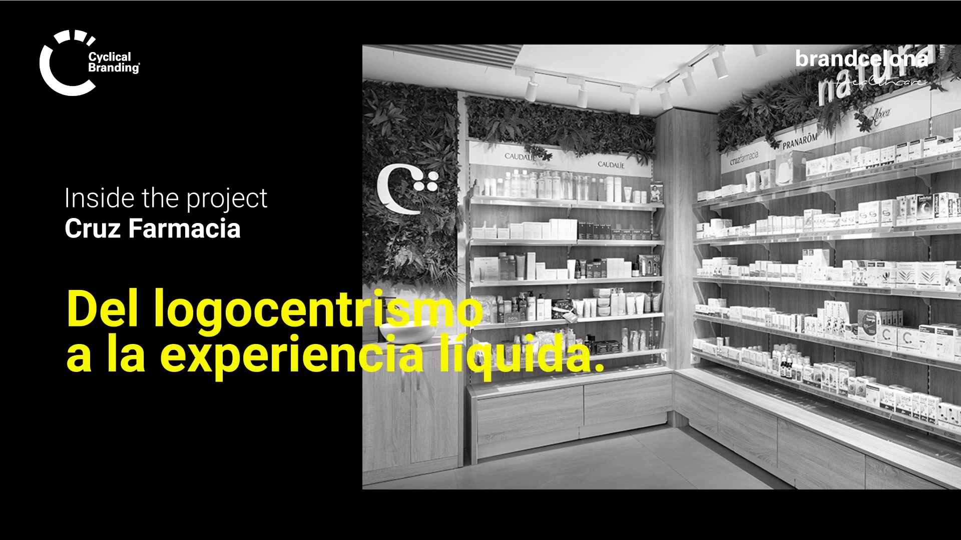
We are happy to share one of our latest projects: @cruzfarmacia designed by brandcelona® through our Cyclical Branding® methodology.
There are three key concepts to have a succesful brand: having a coherent brand experience with your brand purpose, being transparent with users and listening to them to keep the relationship. Also working with impact, coherence and differentiation will give us the opportunity to connect with our ambassadors. In a content saturated century the key point is to make users fall in love.
In the 21st Century, pharmacies have the great challenge of a lack of uniqueness since they all share a cross as a symbol, a graphic sign that shows “pharmacy” in the main door and a healthcare professional in a white coat.
In a world which is constantly evolving, the difference is to transform visibility into preference and this is all posible thanks to the vision of being a gamechanger.
Farmacia Cruz is an example of Smart Brand, a new pharmacy business ready for the new era.
